

Project Summary
Over the course of this capstone project, I successfully designed and prototyped Salubris, a mobile supplement tracking app aimed at helping users build consistent wellness habits. Guided by user research and validated through usability testing, I created an experience that prioritizes simplicity, reliability, and gentle guidance. From initial discovery to high-fidelity design, this project allowed me to apply a full UX/UI process — including persona development, wireframing, branding, and iterative testing — to deliver a solution that responds directly to user needs and behaviors.
Project Overview
How It Started
The inspiration for this project came from someone very close to me—my mom. Over the years, I’ve watched her juggle a multitude of supplements, often struggling to keep track of which ones she needs to take and when. This process, while crucial to her health, often felt like a hassle. I wanted to find a way to simplify it, not only for her but for others who might be facing the same challenges. This desire to help ease the burden of supplement tracking led me to create a solution: Salubris.
The Problem
For many people, managing a daily supplement routine can feel like an overwhelming task. With multiple supplements to keep track of, it's easy for users to miss doses, forget when to reorder, or simply feel stressed about staying on top of it all. This not only disrupts their wellness routines but also adds unnecessary mental clutter. What users need is a simple, reliable solution that helps them stay consistent and make supplement tracking effortless.
Who We are Designing For
Salubris is designed for individuals who take daily supplements as part of their wellness routine but struggle with consistency and tracking. This includes:
Busy adults managing work, family, and health goals who want simple and reliable reminders
Older adults looking for an intuitive digital solution to support their established supplement routines
Across both groups, users expressed a desire for a system that reduces mental effort, reminds them gently, and helps them stay consistent without added stress.
The Design Process
User Research
To better understand the challenges people face when tracking supplements, I conducted user interviews. My goal was to uncover pain points, routines, and attitudes around supplement use and wellness tracking.
3
semi-structured user interviews
20
interview questions that explored daily routines, supplement habits, and tracking preferences
Key Findings
How Users Felt:
“I gotta go review the visit summary notes so I can know what [was said], because it's hard for me to remember after so much incoming sensory information.”
“Because if I didn't make a demarcation indicating that I had taken it, then I could go about my day and then not remember because I had so much brain fog, not remember that I took it, think that I missed taking it, and then take it again without knowing that I already take took it.”
“But, again, there's no alarm.”
“I wish all my notes could be in a central place and when I go to the doctor, then I can just pull up my medical notes and say there's a date with each one and the doctor I talked to about it.”
These insights helped define the direction for Salubris: a mobile app that gently guides users toward supplement consistency with minimal friction.
Empathizing with User Goals and Pain Points
Creating a user persona was crucial for understanding the real needs and challenges of people who struggle with supplement tracking. By empathizing with their goals and pain points, I could design a solution that truly addresses their frustrations—whether it’s remembering to take their supplements on time or finding a more efficient way to reorder them. This step helped ensure the app would provide meaningful value and resonate with users' daily lives.
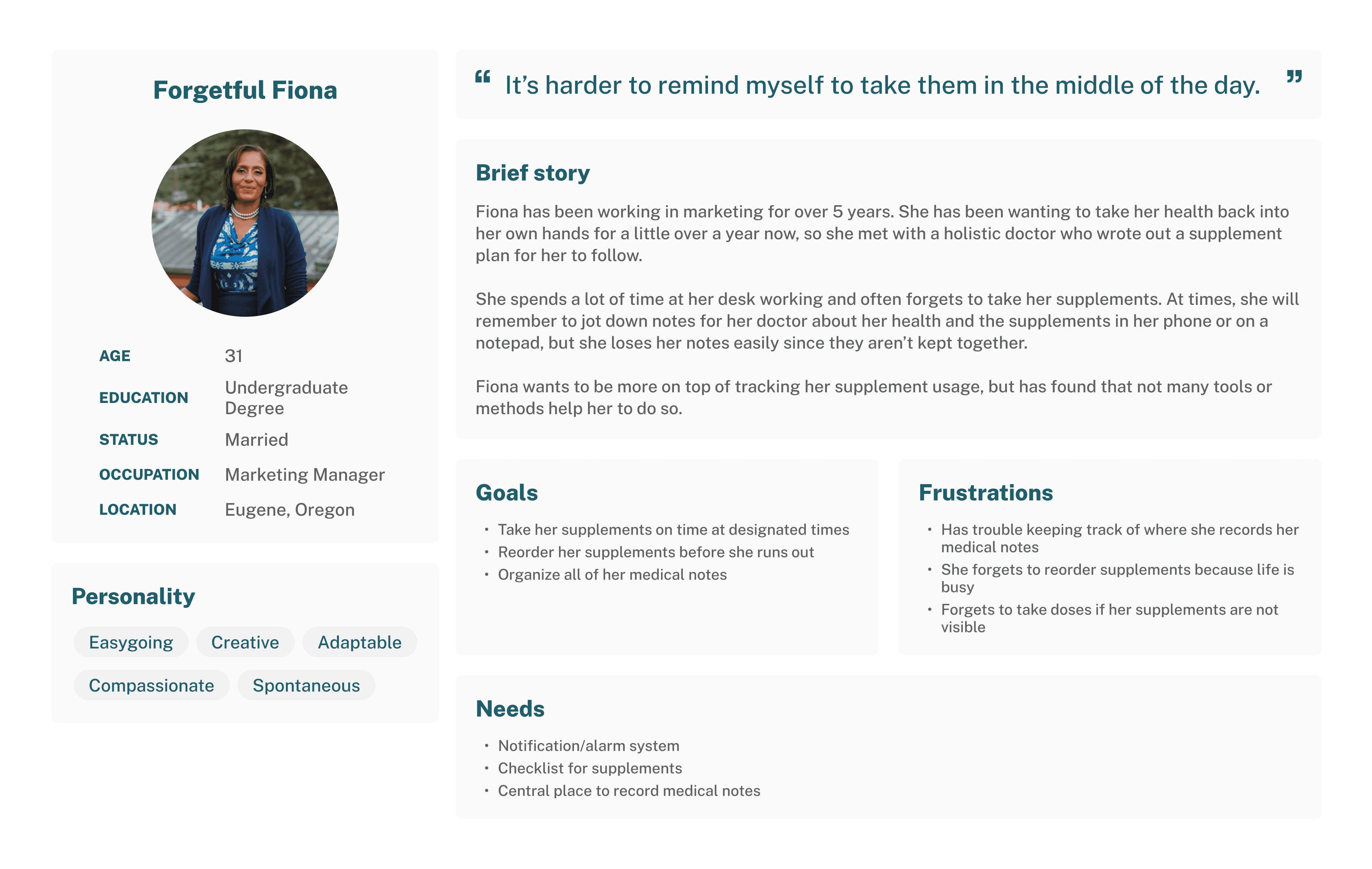
User Needs
I chose to apply the Jobs to Be Done (JTBD) framework to clearly define the core tasks users need to accomplish with the app. By focusing on the specific jobs users are hiring the product to do—such as tracking supplements, setting reminders, and managing refills—I was able to design a solution that directly aligns with their goals and simplifies their daily routine.
Increase the regularity supplements are taken
Decrease number of places medical notes are recorded
Minimize overlap between running out of supplements and needing to order refills
Decrease possibilities of over/under dosing
Questions that Guided My Solution Ideas
How might we prompt people to take their supplements on time?
How might we encourage proactiveness in ordering supplement refills?
What can we do to alleviate the burden of planning to refill supplements?
How might we organize people’s medical notes?
How might we reduce the amount of supplement lists people make?
Defining the Problem
Now that I had synthesized my research, I could identify the core challenge:
How might we ensure users take all their supplements on time?
This question guided the rest of the design process, ensuring the solution remained user-centered, emotionally supportive, and functionally efficient.
Identifying User Stories
With key user needs identified and the problem defined, I moved to create user stories to understand possible use cases of Salubris. The user stories defined the features of the MVP (minimal viable product) and revealed what features could be included in later versions of the product. After this analysis, I determined the MVP would be a supplement tracking app that focused on building habits and logging supplement/health related information. The following are excerpts from the user stories:
As a supplement user, I want to indicate which supplements I’ve take so that I can ensure I’ve taken all my supplements.
As a supplement user, I want to create a supplement routine so that I can know what supplements I should take and when.
As a supplement user, I want to change/update supplements on my list so that I can keep my list as accurate as possible.
As a health tracker, I want to create a new medical note so that I can record important medical information.
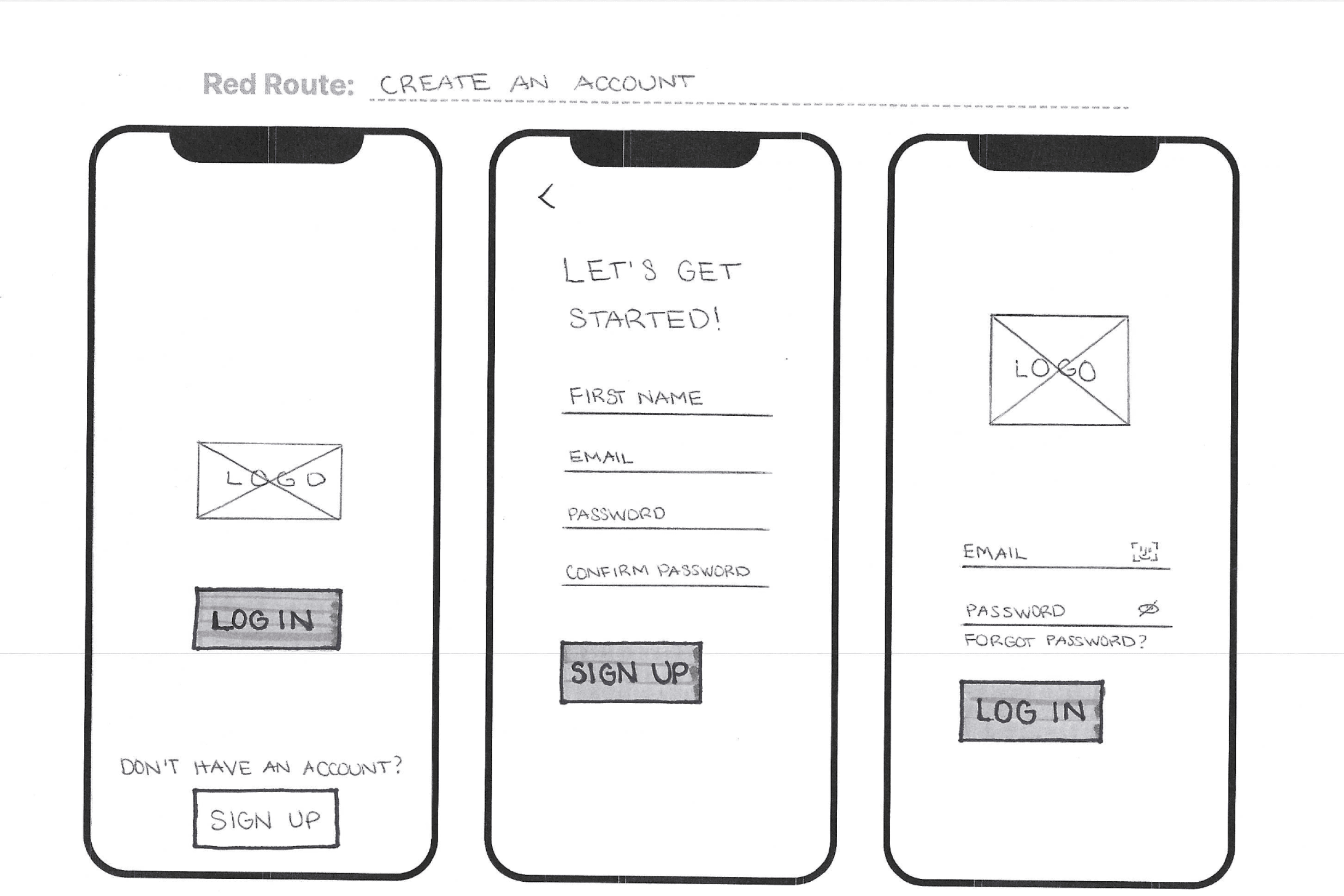
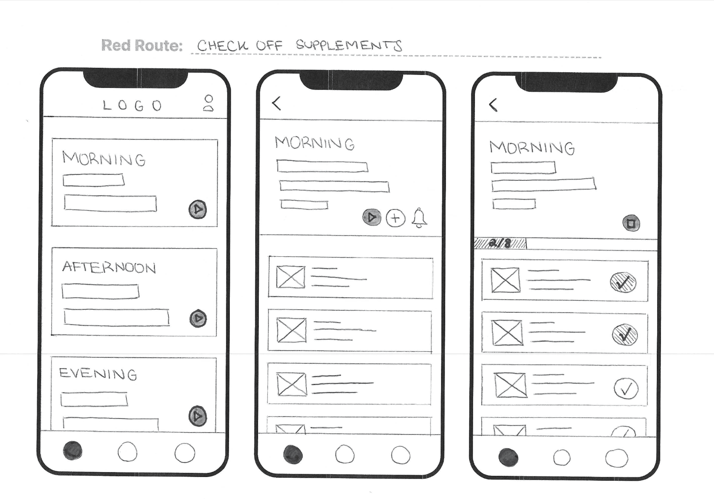
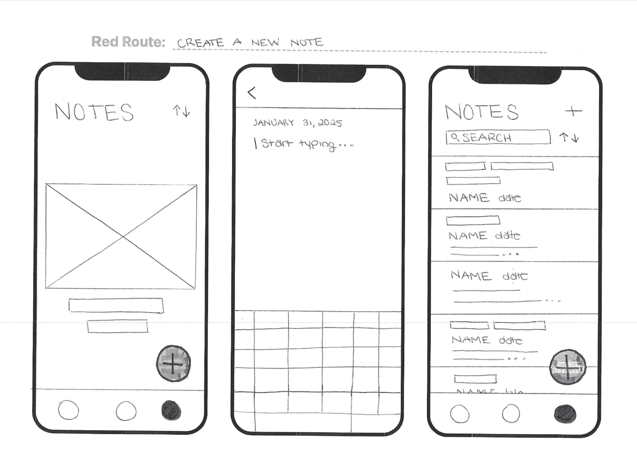
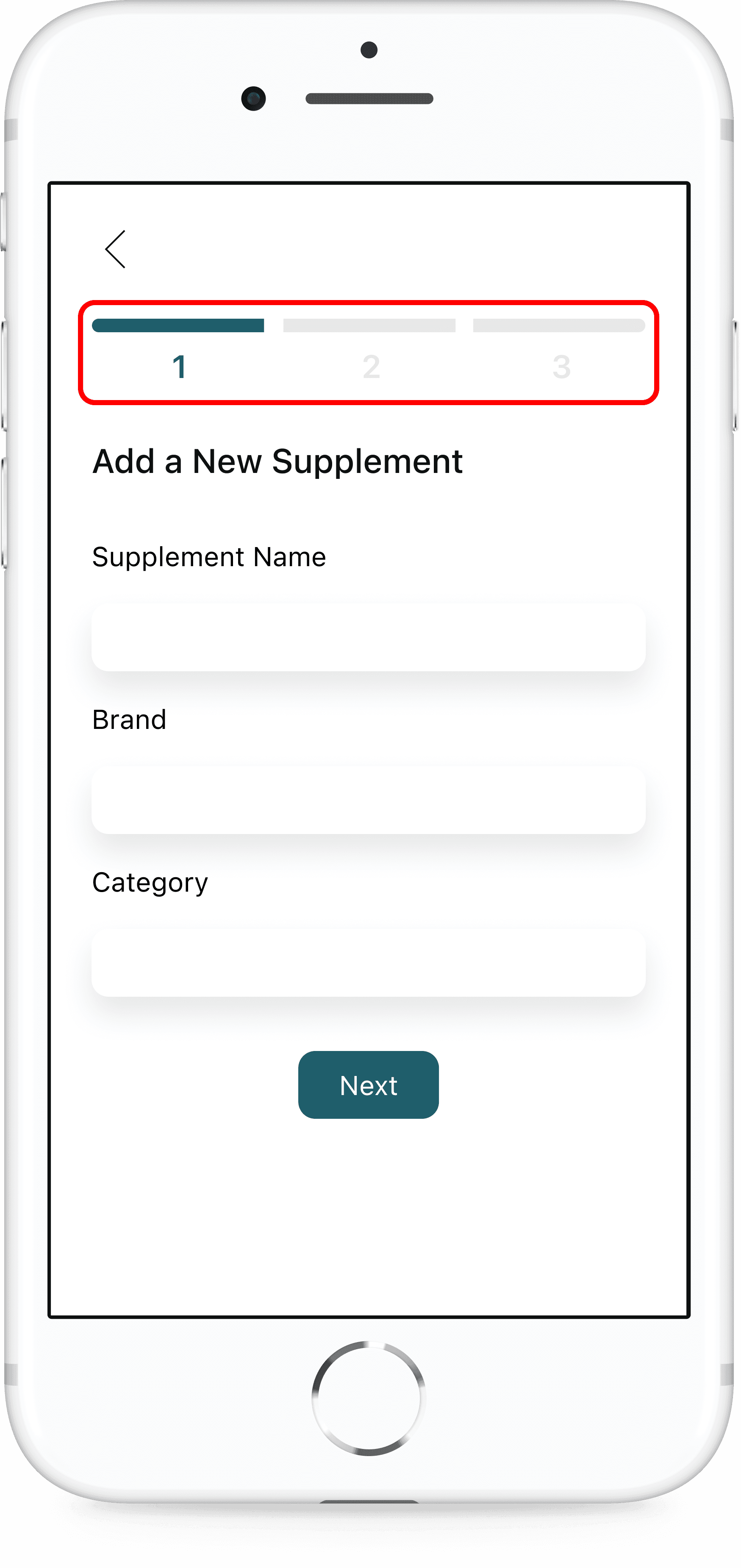
Wireframing
To establish the structure of Salubris, I started with sketches and low-fidelity wireframes to map out essential screens and interactions. Key screens included:
A home screen with a daily supplement checklist
A supplement list screen with an add new supplements flow
A notes page for logging health-related observations
These wireframes helped prioritize simplicity, minimal taps per task, and clarity in navigation.
First Visualizations of the Solution


Refining the Solution

Visual Design and Style Guide

Usability Testing
To validate my design decisions and identify areas for improvement, I conducted usability testing on a mid- to high-fidelity prototype of Salubris.
How I Tested the Solution
Participants: 5 users from my target audience
Method: In-Person and remote moderated sessions via Zoom
What I Wanted to Discover
Discover initial impressions of top hierarchy screens
Assess if the app performs the way users expect it to
Understand the frustrations users experience while using the app
Assess usability issues related to the red routes
Discover if there is anything users expect to be present that is not
1
2
4
5
3
Tasks tested:
What I Found and How I Applied the Insights
1
Issue:
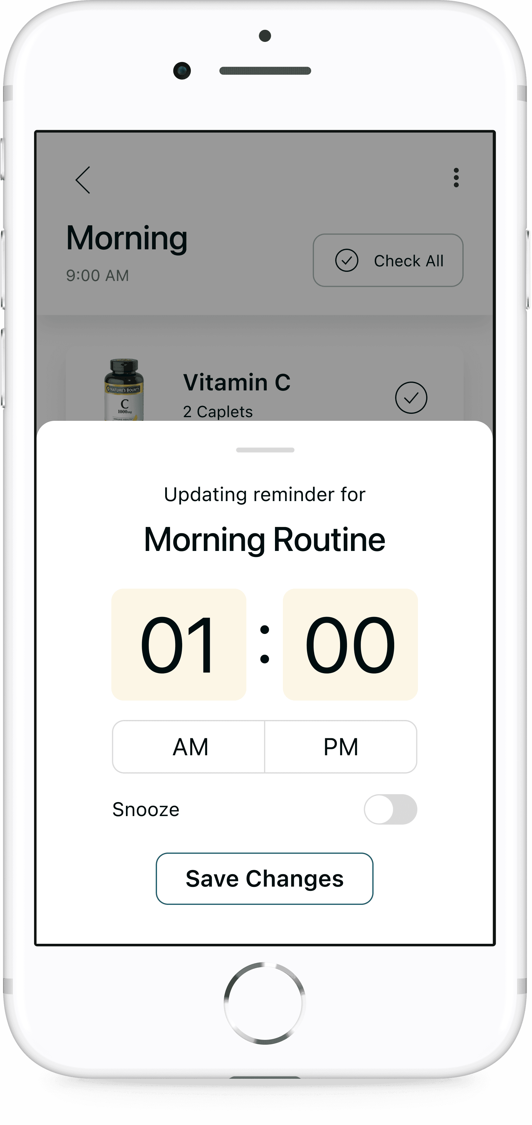
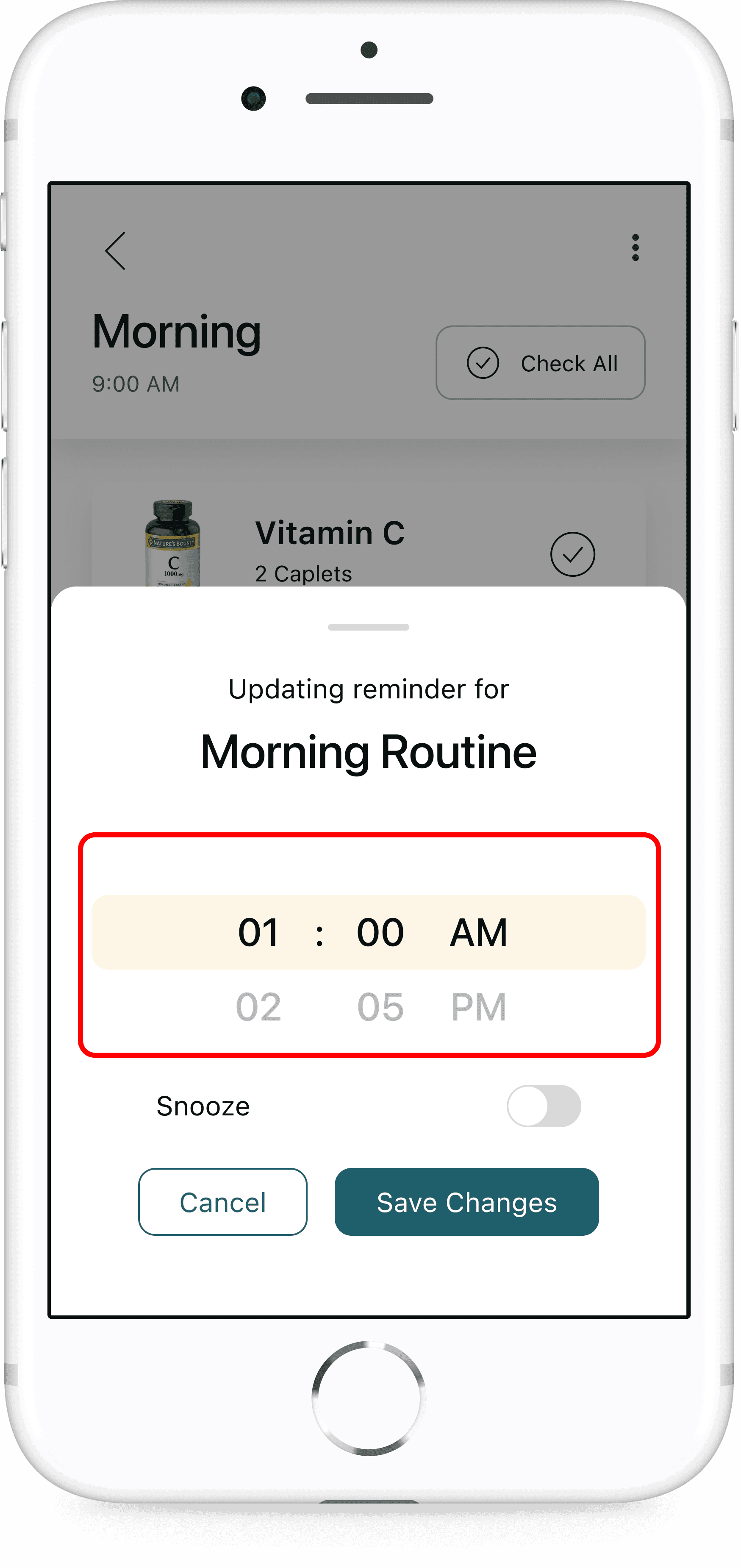
Multiple participants could not figure out how to use the time picker to set reminders. Participants had to skip the remaining part of this task and couldn’t complete the route to setting a reminder. Users expressed they expected to click on the time picker to see an interface that would allow them to change the reminder time.
Iteration:
Show other numbers above and below the touch target area to signal users can scroll to change the time
2
Issue:
Participants could not locate the add a new note button.
Iteration:
For first time note takers, add a primary “New Note” button to empty state screen


3
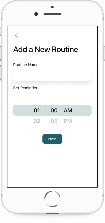
Issue:
Participant pressed the back arrow after only entering the name of routine and scrolling to bottom when adding a new routine.
Issue:
Participants did not set a reminder time when adding a new supplement.
Issue:
Participant did not add any supplements when creating a new routine.
Iteration:
Break up the “Add New [Routine, Supplement]” forms into multiple steps that guide users through the process and shows them which information is required.

Outcome
Following usability testing and refinement, the final version of Salubris received positive responses from users:
Increased confidence in maintaining supplement routines
Clearer task flows, especially around routine setup and reminders
While no formal metrics were gathered, anecdotal feedback showed that users found the experience more intuitive, less stressful, and genuinely helpful.
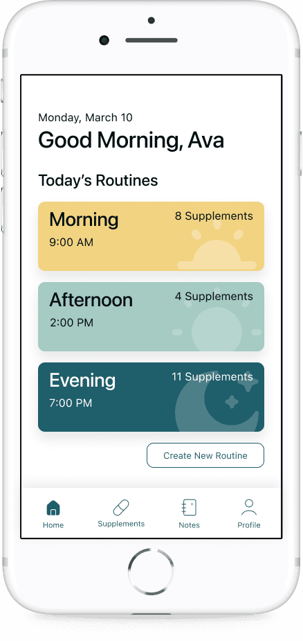
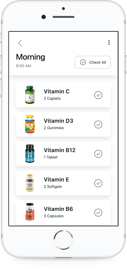
The Solution
Daily Checklist
A clear, tap-to-complete checklist of supplements personalized to each user's schedule — helping reduce cognitive load and encourage consistency.
Custom Routines & Reminders
Users can build routines based on time of day, frequency, and supplement combinations, with flexible reminder settings to support different lifestyles.
Health Notes
A simple notes section lets users jot down daily health observations, supplement reactions, or doctor recommendations in one accessible place.


How it Solves the Problem
By combining gentle structure with ease of use, Salubris empowers users to build better supplement habits. The app minimizes stress, prevents missed doses, and keeps wellness routines on track — all while staying out of the way.
What I Learned
This project taught me how to:
Translate complex user needs into a focused digital experience
Use research insights to drive clear, empathetic design decisions
Balance visual branding with usability to create a product that feels as good as it functions
Embrace iteration — even small design changes had big impact during testing
Next Steps
As this was an MVP, there were many features that would improve the user experience that I would like to develop further. If I were to continue the development of Salubris, I would explore implementing supplement reordering to make the app a one-stop solution for all supplement related tasks, connecting the app to other people for support/accountability, in-depth supplement information, health articles/guidance for new users, and notes connected to specific supplements.
This capstone project not only deepened my technical skills in UX and UI design, but also reminded me that small, thoughtful solutions can make a meaningful impact in everyday life.
Thank You!